
MY ROLE
UX Designer Intern
(Including UX research and UI design work)
CONTEXT
2024.11-12
Intern Project
3 Designers (2 Senior Designers + Me)
TOOLS USED
Figma
CONTEXT & GOAL
Hennessy, a leading icon in the luxury cognac industry, aimed to reinforce long-term affinity among its most valuable Chinese mainland Le Club members — exclusiveness-driven consumers at the top tiers (Level 7&8) of its membership program.
To achieve this, Hennessy identified global travel as a key scenario of influence — a setting where luxury, exclusivity, and cultural connection naturally converge. By enhancing membership benefits in these travel contexts, the brand saw an opportunity to deepen emotional resonance and create memorable, loyalty-reinforcing experiences.
In the short term, this initiative was first launched to support the Chinese New Year campaign at Changi Airport starting December 2023, serving as both a seasonal engagement touchpoint and a testbed for scalable, experience-driven loyalty features.
SOLUTION

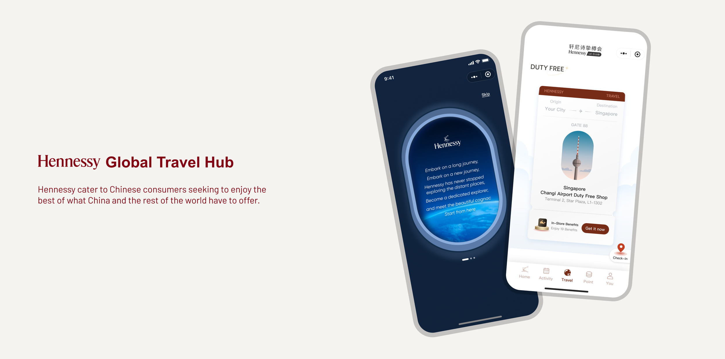
Onboarding Process for Guided Benefit Discovery
Introduces the full suite of new travel benefits upon first interaction, ensuring immediate awareness and foundational understanding
Utilizes immersive, full-screen pages for high impact and clarity.
Explains benefit categories and usage methods upfront.

LBS-Based Benefit Notification
Delivers location-based notifications (e.g., upon airport arrival), acting as a timely, contextual trigger (Hook Model) to encourage benefit usage.
Highlights the most relevant travel benefit for the user's current context.

Centralized & Organized Travel Benefits Hub
Provides a dedicated central destination aggregating all travel benefits.
Balances quick access to information with exploratory browsing by organizing benefits based on estimated time commitment and how they are received.
Addresses existing IA challenges and maintains its scalability for the future.

Dual Reward Structure (Instant & Long-Term)
Establishes two primary benefit types: instant benefits and accumulating points earned via engagement (purchase, check-ins, surveys).
Designed to balance immediate value perception with sustained, habit-forming engagement.
DEFINE
BEFORE WE JUMP INTO THE BRAINSTORM PHASE, LET’S LOOK AT WHAT THE TARGET USERS OF THIS PROJECT — HENNESSY’S HIGH-TIER CONSUMERS AND WHAT THEY VALUE MOST

WHERE ARE THE BEST TOUCHPOINTS FOR THESE HIGH-TIER CONSUMERS?
After speaking with project managers and our clients, we found that over 73% of high-tier members have used or are currently using the global travel-related module, highlighting a strong behavioral link between this segment and travel scenarios. However, nearly 90% of users stop engaging after just one use, revealing a significant drop-off and untapped opportunity for deeper engagement.
This guided us to explore global travel not just as a functional offering, but as a strategic space to deliver long-term experience-driven and exclusivity-oriented value. Hennessy’s brand image—bold and refined—naturally aligns with the aspirations of global travelers, making this direction both meaningful and brand-consistent.
Our design team quickly aligned on this direction and began identifying opportunity areas based on the user journey.
TARGET USER CHALLENGES AND BRAINSTORM OPPORTUNIES THROUGH PROPOSED USER JOURNEY
After that the client confirmed plans to introduce new benefits, such as exclusive travel perks, check-in rewards, and restaurant collaboration gifts.
Recognizing the wide variety of benefit categories, we explored multiple approaches to information architecture and ultimately agreed on creating a new hub page to consolidate and showcase all benefits. This solution not only improves discoverability and navigation, but also enhances clarity and engagement for high-tier users.
In addition, to minimize user interruption and address the risk of users forgetting available benefits, we designed a targeted pop-up notification system to deliver timely reminders based on user behavior and context.

The in-platform design focuses on a user flow from benefit receipt to redemption, supported by a contextual pop-up system for timely reminders and guidance.
Next, I’ll walk you through one of the key challenges I encountered during this design process—the hub page design.
BRAINSTORM
After alignment for module-positioning, we at first delivered our own draft for this hub page.

The client identified a key challenge in the hub page’s information architecture:
Uncertain whether the content classification should be based on benefit redemption location or attraction scale?
Our client’s feedback prompted our design team to revisit and refine the information architecture of the hub page. A thorough evaluation of membership benefits is essential to ensure a more comprehensive and strategic approach.
The analysis focused on three key aspects:
Attraction: Assessing the scale of benefits and their appeal to users.
Accessibility: Evaluating service availability across cities, the number of locations per city, and transportation convenience.
Business Considerations: Reviewing the verification process and operational feasibility.
Following the establishment of scoring standards, the results clearly revealed traits of each benefit.

With numerous benefit attributes serving as categorization criteria, identifying the right starting point became increasingly challenging.
I realized it was time to step back and refocus on user personas and their core needs. By revisiting foundational insights, I reorganized users into two key groups: time-pressed travelers and leisure travelers.


THEREFORE, OUR ACTUAL DESIGN CHALLENGE IS
How might we seamlessly balance efficiency with engagement, enabling users to quickly find main benefits while also encouraging exploration and enjoyment?
Based on the differences in our users’ travel schedules, we initially decided to organize benefits into two sections: duty-free stores and cities, serving as the most suitable “containers” for presenting benefits.
Structuring the primary information architecture around these locations—duty-free stores and cities—offers two key advantages:
It effectively addresses two critical factors: user time sensitivity and benefits appeal, aligning with real-world travel scenarios to enhance usability and convenience. Duty-free stores, located primarily in airports, provide easy access for all travelers, regardless of whether they have tight schedules or ample leisure time. In contrast, partner restaurants and flagship stores are scattered throughout the city, making them more suitable for time-flexible travelers who can explore and enjoy benefits at their leisure.
It leverages existing store detail pages within the travel mini-program, ensuring efficient implementation and timely project completion within tight deadlines.

The information presentation style can remain flat for the city section; however, applying the same approach to the duty-free store section would be ineffective. Thus, duty-free stores are categorized into two groups based on the available benefits. The more important stores—those offering member gifts or limited-time check-in points—are prominently displayed in the carousel slides. The remaining stores, which hold lesser significance, are hidden within the list and can be accessed when users click “View All.”

But, currently, only 6 out of 26 check-in locations have direct and visible access points, while the remaining locations are distributed across two different sections, making it challenging for users to find them. Given that check-in is one of the simplest activities, requiring minimal effort and offering relatively small benefits, users may find the extra effort needed to locate access points frustrating, leading to a disappointing experience.

Thus, is it possible to optimize the information architecture to ensure all check-in locations are easily discoverable within relevant sections while minimizing redundancy and confusion?
Now, it was time to relook at the traits of these benefits again, I surprisedly found that check-in points are the only benefit that doesn’t require verification! Moreover, check-in activity is one of the most common activities, and users are already familiar with its rules, introducing a separate floating button for quick access can enhance the user experience by adhering to the shortest user path principle. This approach also helps clarify the hierarchy of benefit types, making the structure more intuitive.

Subsequently, through our collaboration and discussions with clients, we refined other aspects of the page to enhance the sense of benefits and brand identity. Additionally, we incorporated travel-related elements to optimize the UI, further emphasizing the hub’s travel theme.
Our final information architecture effectively addresses both usability and scalability challenges by incorporating key factors such as benefit rarity, user scenarios, and perception, ensuring a well-balanced and comprehensive solution.
Of course, an experience-driven module like this demands more than just static design. While the hub page’s information architecture provides a solid foundation for seamless navigation and fast content discovery, pop-ups play a more critical supporting role in creating a sense of serendipity. They deliver targeted, real-time interactions that enhance engagement and act as dynamic triggers, all while maintaining harmony with the hub page to ensure they add value without disrupting the user flow.
For instance, one key purpose of pop-ups is to highlight entry points for essential benefits in the user’s current city. Recognizing that pop-ups are designed to spotlight priority content, I selected the most enticing member gifts as the focal point. After consulting with developers, I ensured the pop-ups appear only when member gifts are available in the user’s city, tying their display to location-based content. To achieve this, I introduced a location authorization prompt as the final step of the onboarding guide, ensuring both feasibility and functionality for the pop-up experience.
Outcome


Reflection
DIFFICULTIES I MET & THINGS I LEARNED
Strategic Thinking Beyond Aesthetics
While I successfully introduced scenario-based and stylistic design elements to enhance the visual appeal and align with the travel theme, I recognized that ROI and operational scalability should also be integral considerations in design decisions. Early design concepts, though engaging, overlooked long-term content production and maintenance costs. This experience reinforced the importance of incorporating business strategy into the design process to ensure sustainable solutions.
Iterative Problem-Solving Through Collaboration
The project’s evolving nature, with frequent updates to membership benefits and participating cities, required continuous iteration and close collaboration with cross-functional teams. Adapting to these changes helped me develop a more agile approach, where ongoing user feedback and stakeholder input played a critical role in refining the information architecture and feature prioritization. This experience deepened my appreciation for the iterative nature of UX design in dynamic business environments.